Coprata
Role: Product Designer
Team: CEO, Product Manager
Duration: Nov. 2022 - Aug. 2023
Team: CEO, Product Manager
Duration: Nov. 2022 - Aug. 2023
Coprata is a pre-seed start-up focused on at-home stool analysis for gut health monitoring. As a Product Designer, I worked on a variety of projects including app concept development, landing page design, brand identity, and visual design for the investor deck and website.
The Problem
Individuals who suffer from gastrointestinal (GI)-related health issues and those seeking to proactively monitor their digestive health face significant obstacles in tracking their gut health without frequent doctor visits. Although they can record observations of what they see and how they feel, accurately tracking stool characteristics is a daunting, time-consuming task.
Research
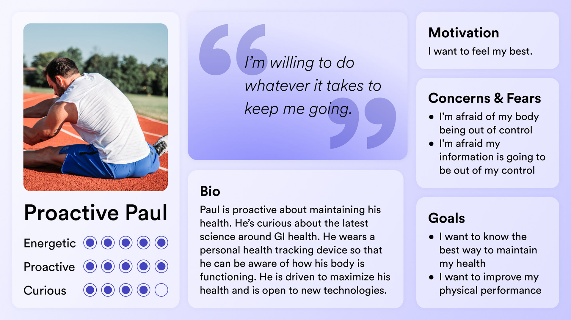
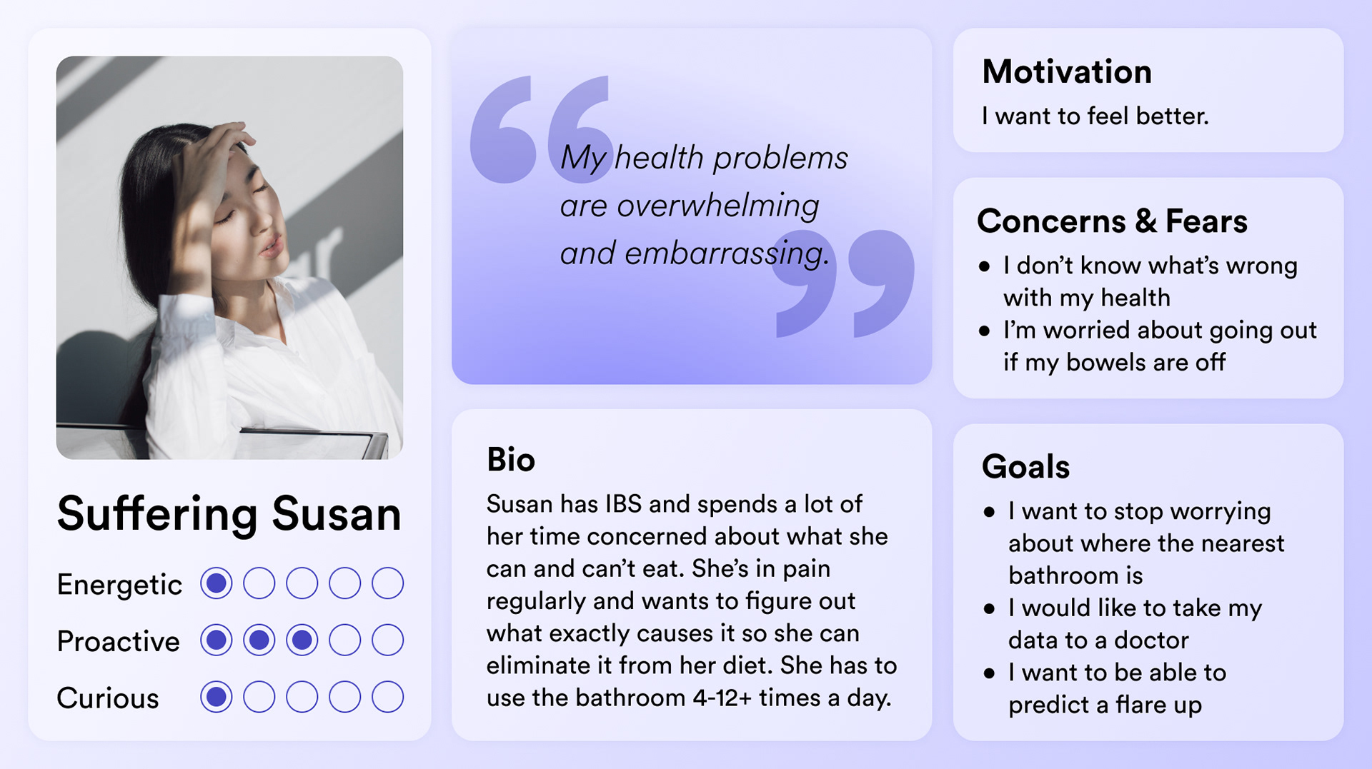
To kick off my first project, which was designing an app concept, I conducted market research and analyzed user personas to understand their unique needs. This helped me ensure that the app would be inclusive and cater to a wide range of users with different requirements. Additionally, I researched apps that connect to wearable technologies such as Whoop, Oura, and Withings.
Solution
While Coprata devised an innovative smart toilet capable of measuring key digestive health indicators at home, these insights needed to be easily accessible to users. As such, I spearheaded the design of a complementary app that delivers the data collected by the smart toilet, to users, giving them a comprehensive view of their gut health conditions on a daily basis. I also created landing pages to measure the interest different user groups would have in Coprata's products.
Throughout the design process of all assets, great emphasis was placed on ensuring user-friendliness and simplicity, allowing individuals of all ages and technological backgrounds to access and interpret their gut-health metrics. I also aimed to cater to a wide range of goals, including managing GI illnesses such as IBS, maintaining overall digestive health, and monitoring for early signs of colon cancer. By combining the cutting-edge capabilities of the smart toilet with an intuitive app interface, Coprata offers a holistic approach to digestive health monitoring, empowering users to take charge of their well-being and make informed decisions for a healthier lifestyle.
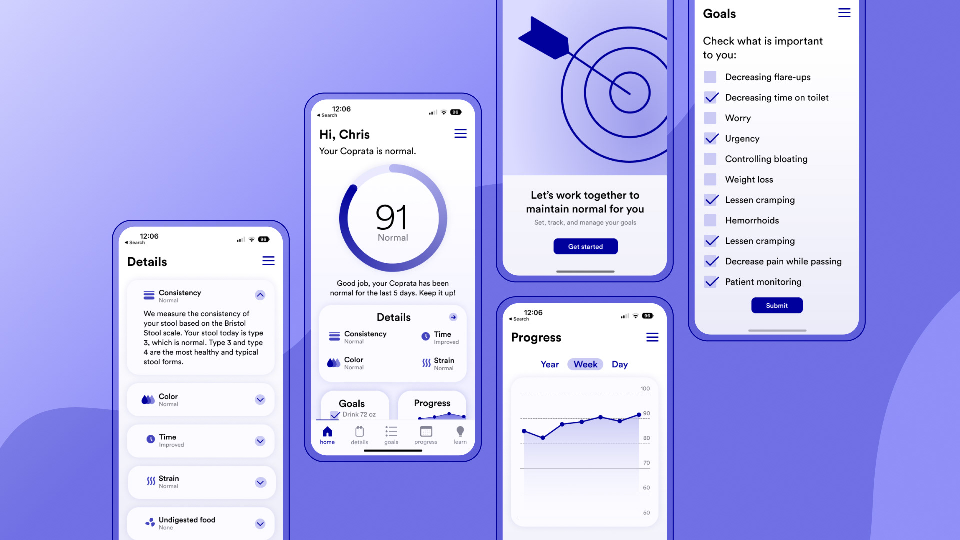
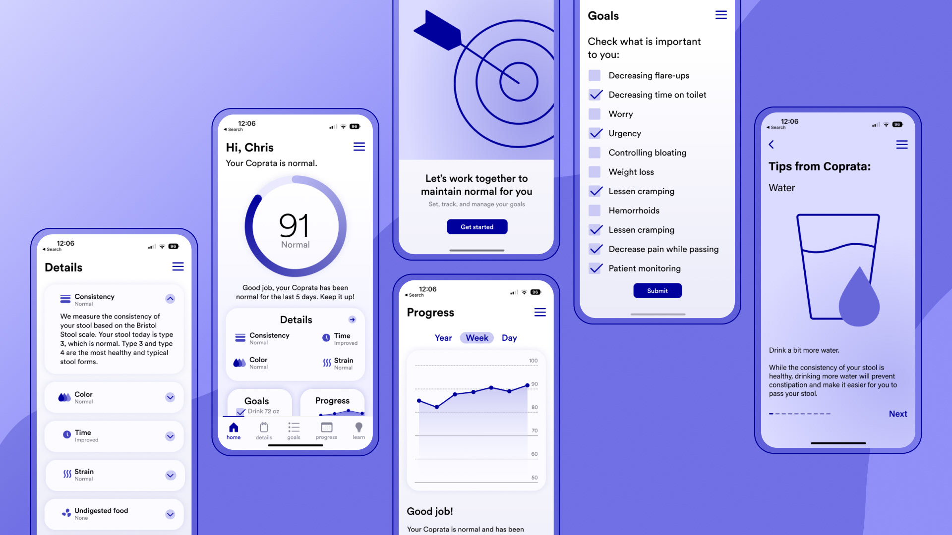
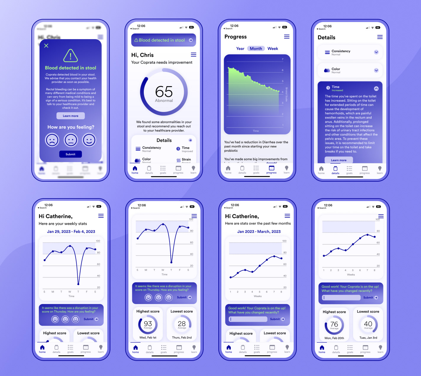
App Concept
Based on my research, I sketched out the screens I needed and developed wireframes in Figma.
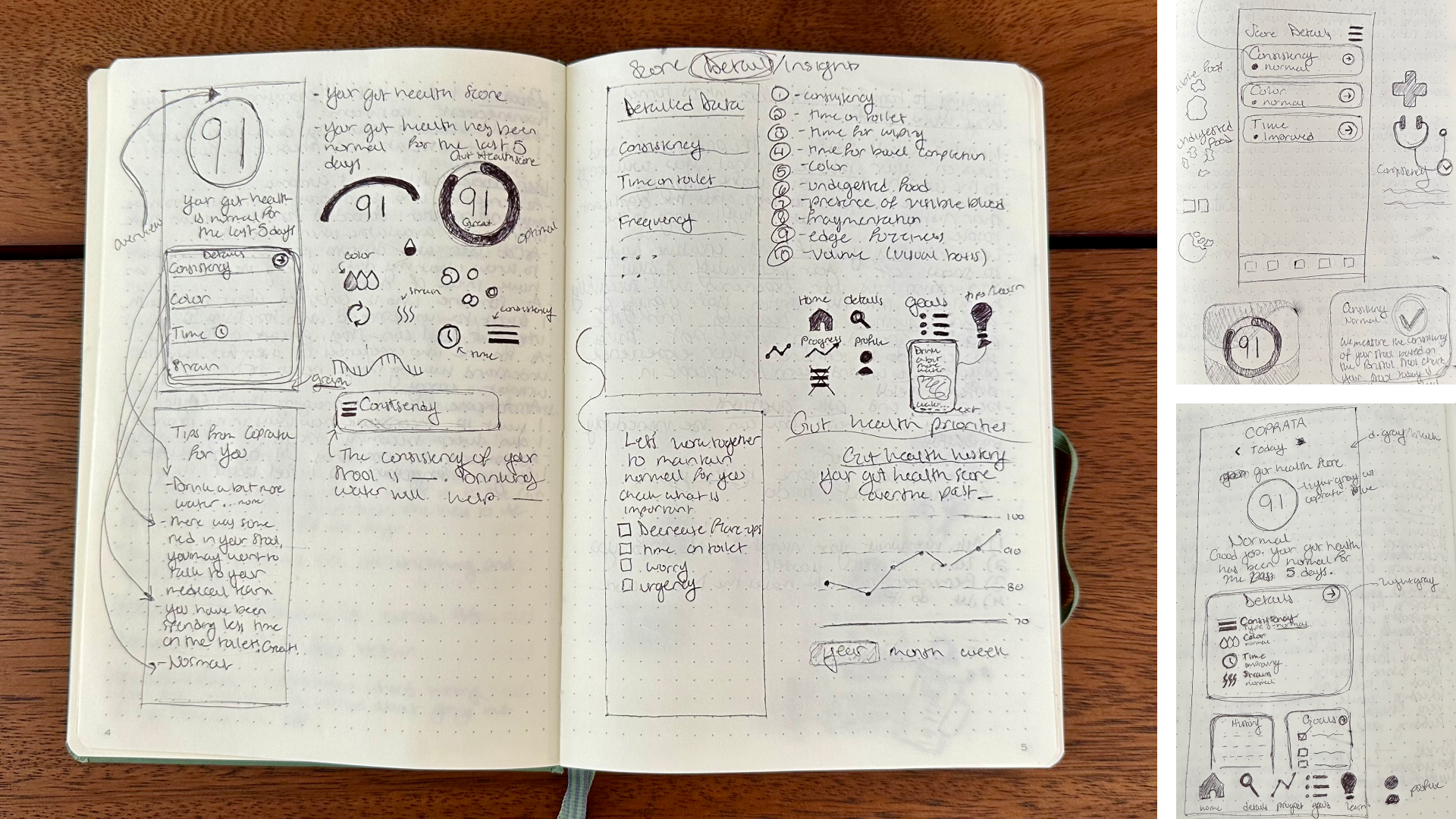
I then created high-fidelity mock-ups, refining the design as I went along. While the structure and content remained consistent with my original sketches, the visual components evolved as I developed the UI. I ensured that the design was clean and sophisticated while catering to different users with various goals. To enhance the user experience, I employed friendly language, typography, and color schemes, aiming to make the serious and often overwhelming topic more approachable and less intimidating. By striking the right balance between professionalism and approachability, the design ensures users feel at ease while accessing essential information about their digestive health.
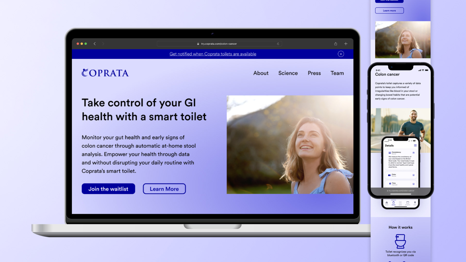
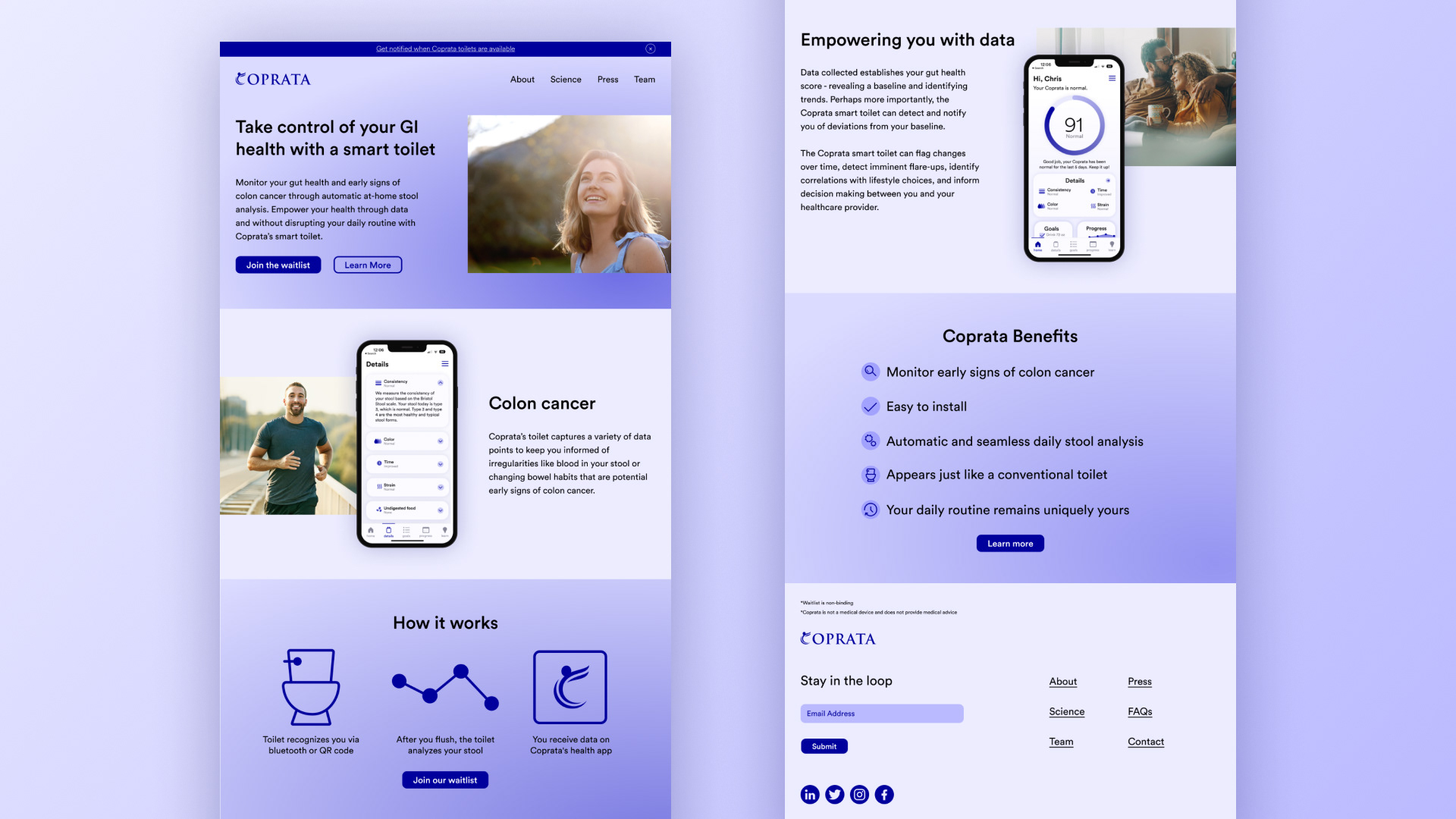
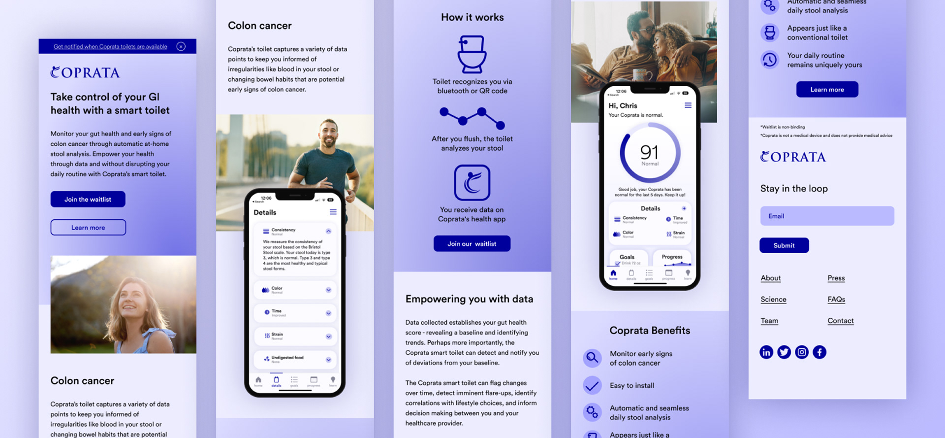
Landing Page
I also designed a landing page targeting audiences searching for colon cancer topics such as "colon cancer risk," "early signs of colon cancer," and "how to prevent colon cancer." Drawing from the UI I created for the app concept, I designed both the mobile and desktop versions of the landing page in Figma before building it out in Unbounce, a low-code landing page builder.
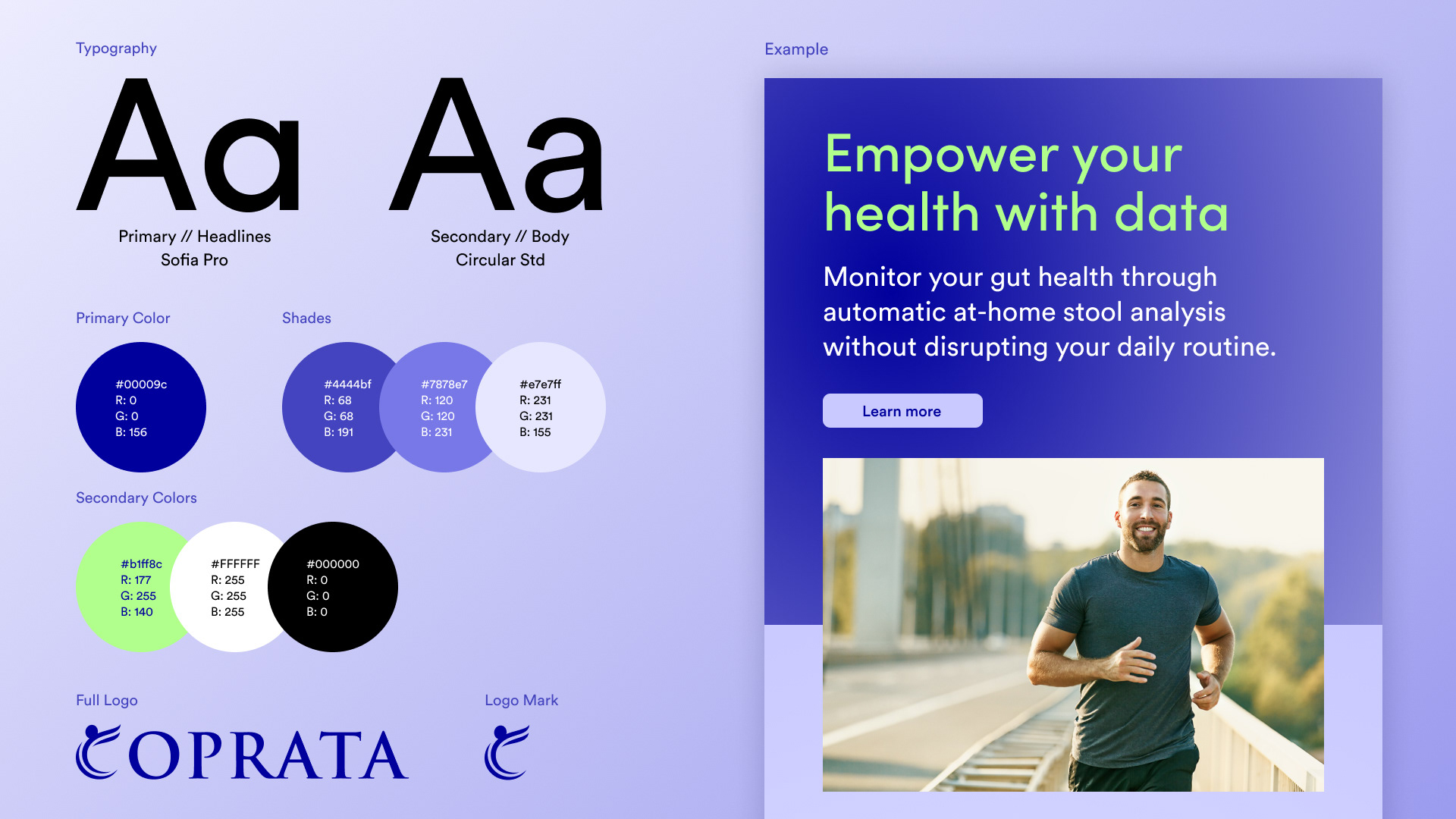
Style Guide
I was asked to come up with a style guide based on the UI I came up with for the app concept and the landing page that could be used across all of the brand's assets. The company wanted to add an accent color to complement Coprata's primary blue, so I selected a bright green as green represents health and it stood out against the dark blue. They also asked for another font to complement Circular Std, which I used in the app, so I paired it with Sofia Pro.
Additional App Screens
In addition to the initial six screens, I designed a set of screens that incorporated warnings and notifications for users to track their gut health changes and take appropriate action. I used the new accent color to highlight any changes and warnings to attract the user's attention.
Other Visuals
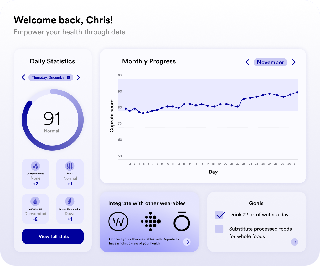
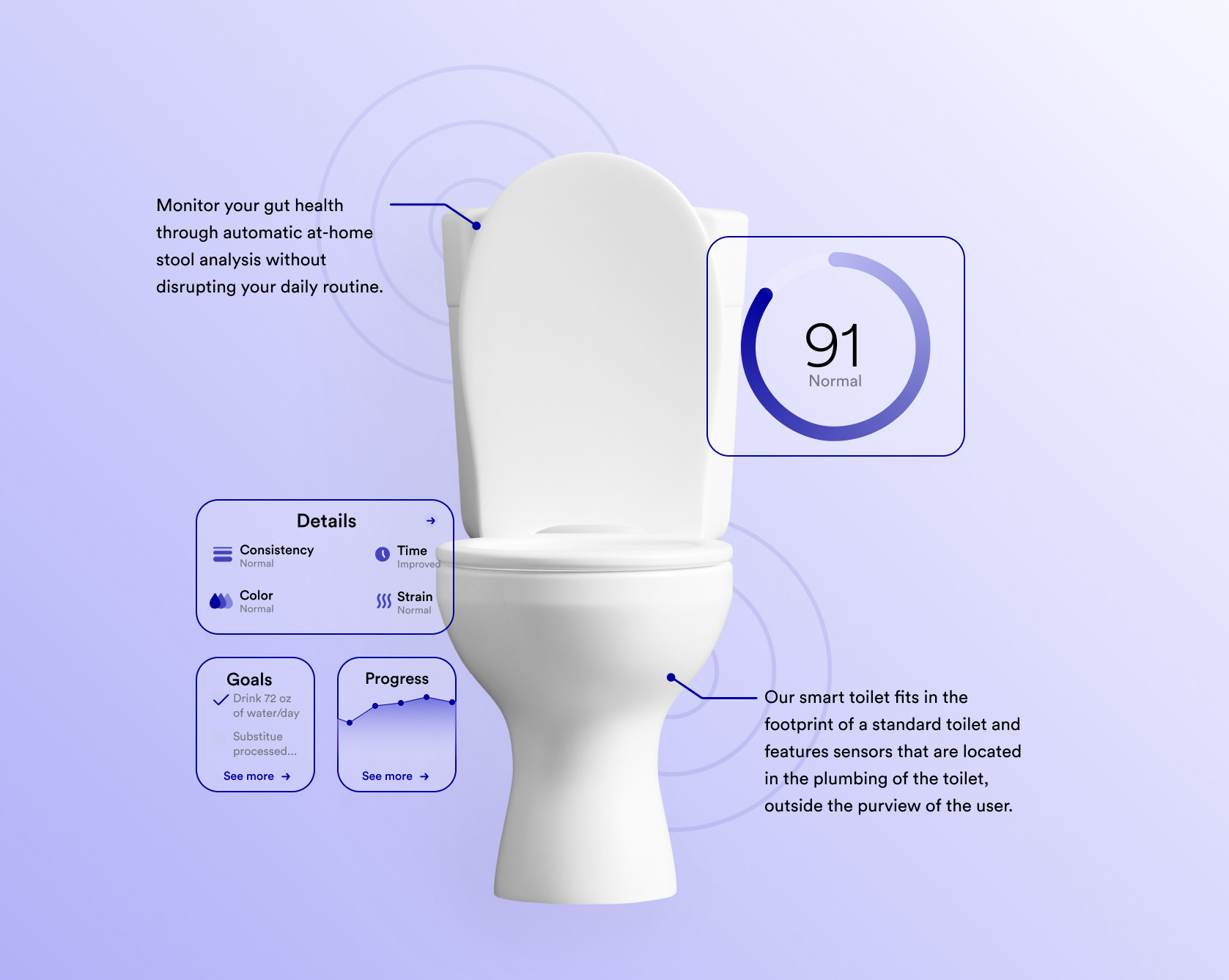
I also designed visuals for the investor deck and website, including a one-page dashboard and a toilet visual explaining how the hardware and software technologies work together and what they look like.
Takeaways
Working at an early-stage start-up has provided me with a unique opportunity to create a design system and products from scratch. I've learned the importance of design iteration and establishing a system that can evolve as product and user needs change.