Spanx Site Redesign and Headless Migration
Role: Product Designer
Team: Creative and Brand Teams, Director of Digital Product Design, Product Managers, Engineering Leads
Duration: Jan. 2025 - Oct. 2025
Team: Creative and Brand Teams, Director of Digital Product Design, Product Managers, Engineering Leads
Duration: Jan. 2025 - Oct. 2025
Spanx was undergoing a full rebrand while transitioning to a headless CMS architecture—a unique opportunity to rethink both the visual language and structural foundation of spanx.com. I collaborated with my design director to develop a UX strategy that supported both initiatives, redesigning the site to reflect the new brand while optimizing for personalization, flexibility, and long-term scalability.
The Challenge
Redesigning the site alongside a headless migration allowed us to avoid rebuilding twice—saving significant development time and reducing overhead. The legacy site had accumulated UX debt, with inconsistent navigation. patterns, outdated conversion flows, and a disjointed mobile experience that no longer matched the brand’s premium positioning. The transition to headless offered a clean slate to rethink the experience from the ground up, enabling us to design a modular, flexible system that supported personalization, scalability, and a seamless expression of the new Spanx brand.
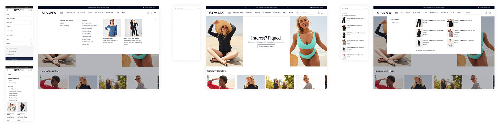
The Old Experiece
Product Discovery
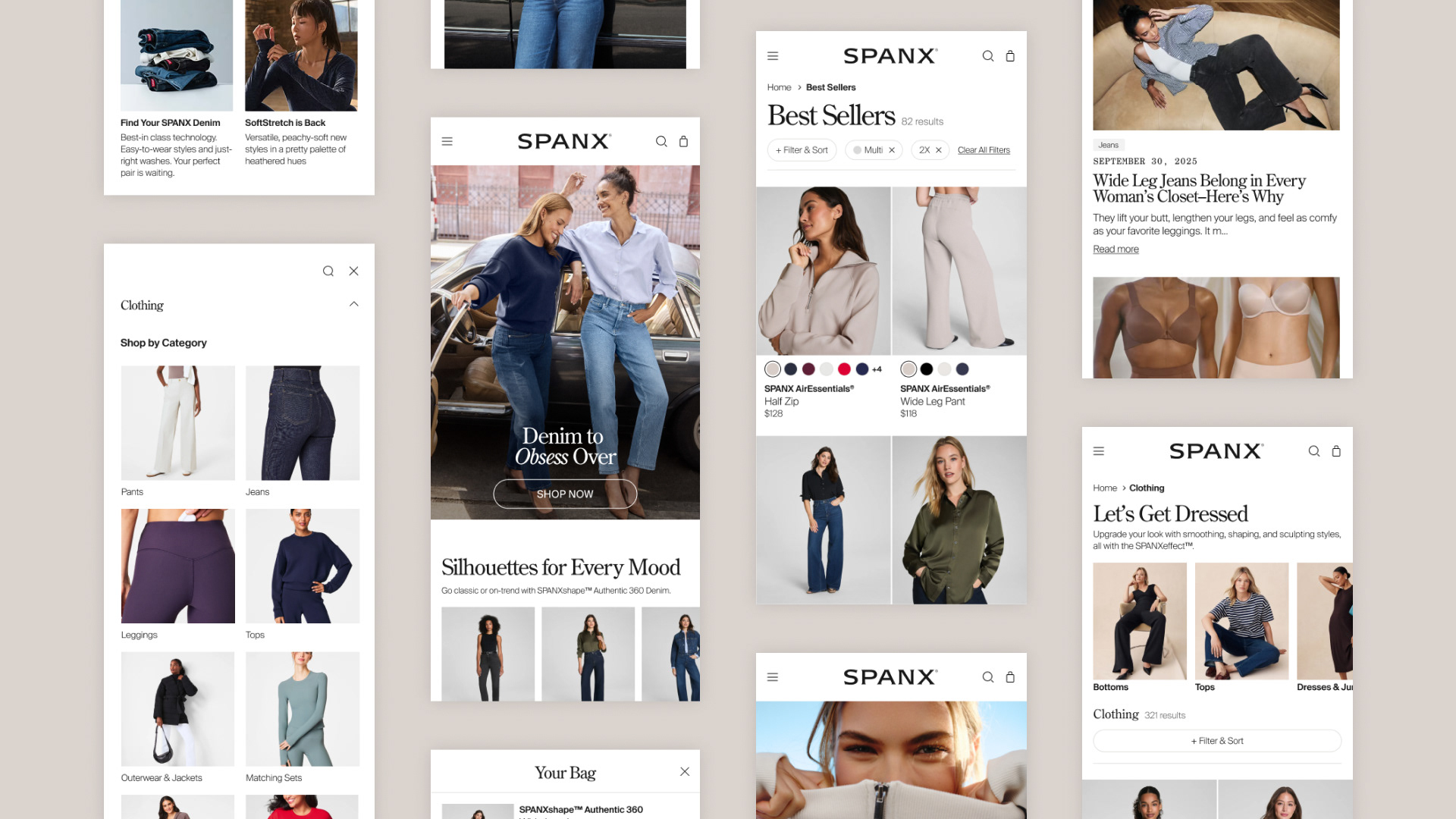
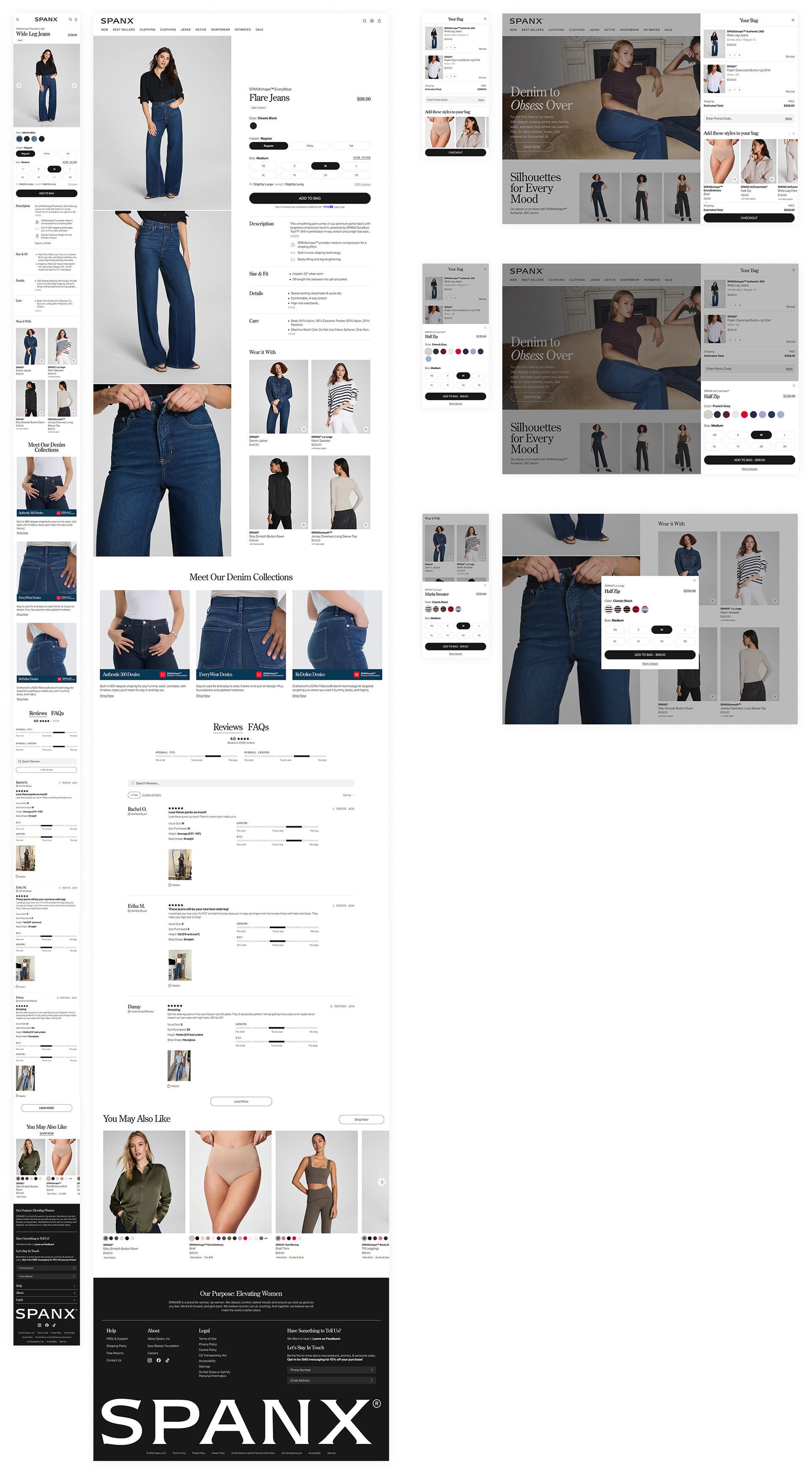
Home & Product Listing Pages: Redesigned the homepage to showcase products more effectively while reducing vertical space consumption. Created a new PLP visual nav that ensures product tiles are visible above the fold on both desktop and mobile.
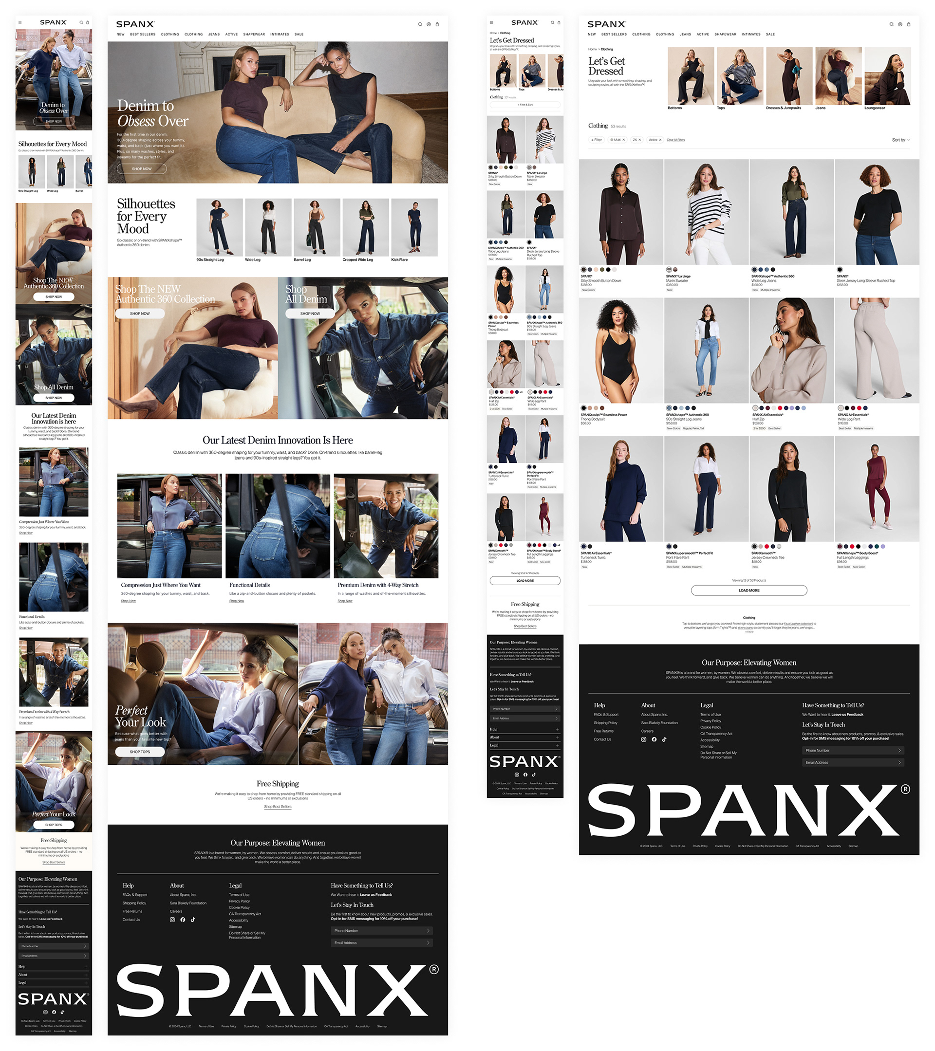
Navigation & Search: Streamlined the main navigation to improve product find-ability and created visual hierarchy that guides users through Spanx's expanded product range. Improved search functionality with visual filters, refined empty states, and smoother mobile interactions
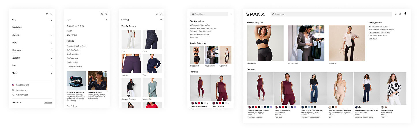
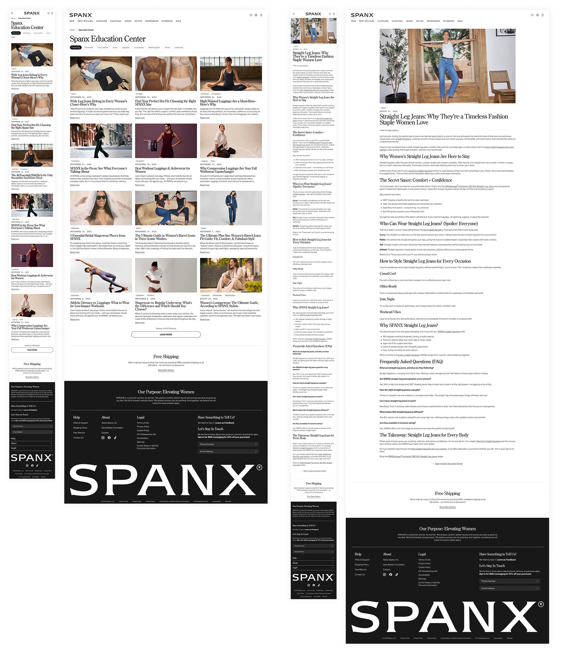
Education Center: Optimized the blog layout to surface more content per row while maintaining readability.
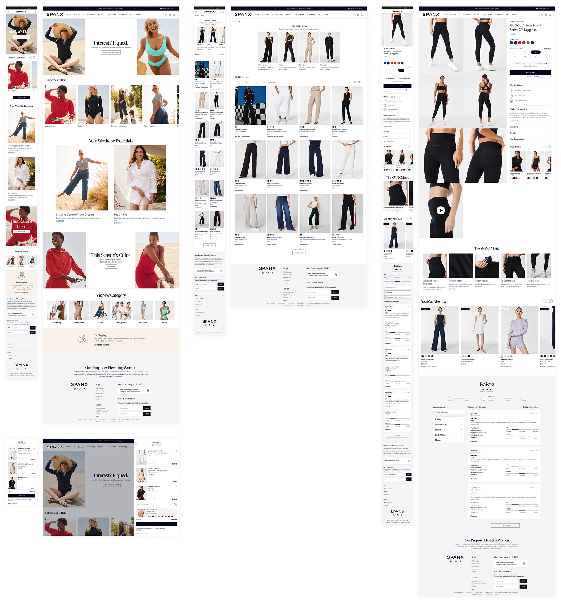
Buy Flow
Product Detail Page, Bag, & Quick Shop: Revamped PDP "Wear It With" component, allowing customers to browse suggested styling options while scrolling through product imagery. Updated reviews UI for better social proof and added strategic cross-sell opportunities through an improved quickshop feature. Redesigned the bag experience to show more recommended products and streamlined the upsell components for better conversion without overwhelming the checkout intent.
Account Management
Transformed static account pages into a visual dashboard where customers can quickly access loyalty status, wishlist, saved addresses, payment methods, and profile information—creating a more engaging post-purchase relationship.
Returns & Exchanges
Reimagined this previously neglected flow, reducing friction in the return process while maintaining clear communication about Spanx's policies and creating opportunities for exchanges over refunds.
Results & Impact
This project marked my first large-scale site redesign, giving me the opportunity to touch nearly every page on spanx.com. Working on an expedited timeline taught me a lot about designing at scale and thinking systematically—every component decision had to work across multiple contexts and user flows.
One of the most rewarding aspects was diving deep into overlooked areas like account creation, sign-ins, and the returns process. These "unglamorous" flows are often where customers form lasting impressions, and redesigning them felt like solving puzzles that directly impact customer satisfaction. The account management work proved especially timely, as it laid the foundation for Spanx's updated rewards program launch.
It's rare to get the opportunity to reimagine an entire site from the ground up, and this project helped me grow a lot as a designer. The experience of balancing brand expression with technical constraints while maintaining user experience quality taught me how to think holistically about complex design challenges, and I'm proud of how we transformed both the customer experience and the technical foundation that will serve Spanx for years to come.