We Rock Charlotte
Role: UI/UX Designer & Researcher
Team: Graphic Design, Copywriting, Video, Public Relations, Photography, Project Management, Paid Media, and Insights interns
Duration: 8 Weeks, June 2021 - July 2021
Team: Graphic Design, Copywriting, Video, Public Relations, Photography, Project Management, Paid Media, and Insights interns
Duration: 8 Weeks, June 2021 - July 2021
The Problem
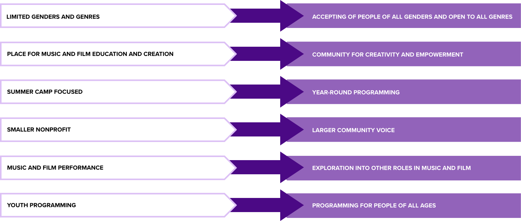
Girls Rock Charlotte, an international nonprofit organization that provides music, film, retreats, and workshops for girls and gender-diverse youth, teens, and adults, was in need of a rebrand that better represented the organization's offerings and welcomed the LGBTQ+ and gender-diverse communities. Our team was tasked with updating the Girls Rock Charlotte brand with a more all-encompassing and empowering name and logo and refreshing their organic social media strategies while providing them with a new website concept.
As the designer UI/UX Designer, my goal was to align the new website with the new brand concept while also improving the user experience and organization of the site. I collaborated with 8 other interns, in addition to a senior digital designer and creative director, to accomplish this task.
Research
To begin the redesign process, I first analyzed the existing Girls Rock Charlotte website and identified the need to simplify the navigation and make it less repetitive. I conducted user research to gain insights into how the site could be reorganized to make it easier for the user to navigate. Additionally, I spoke with stakeholders to understand the primary users and goals of the site, as well as gaps within the current site.
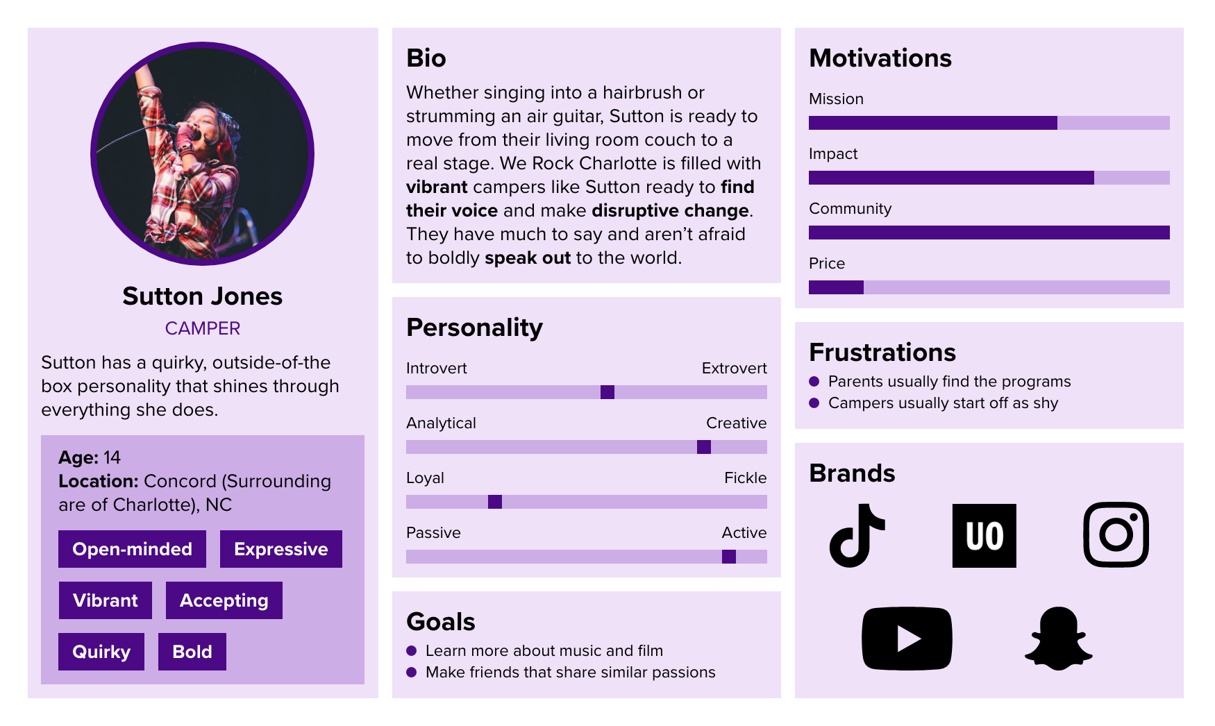
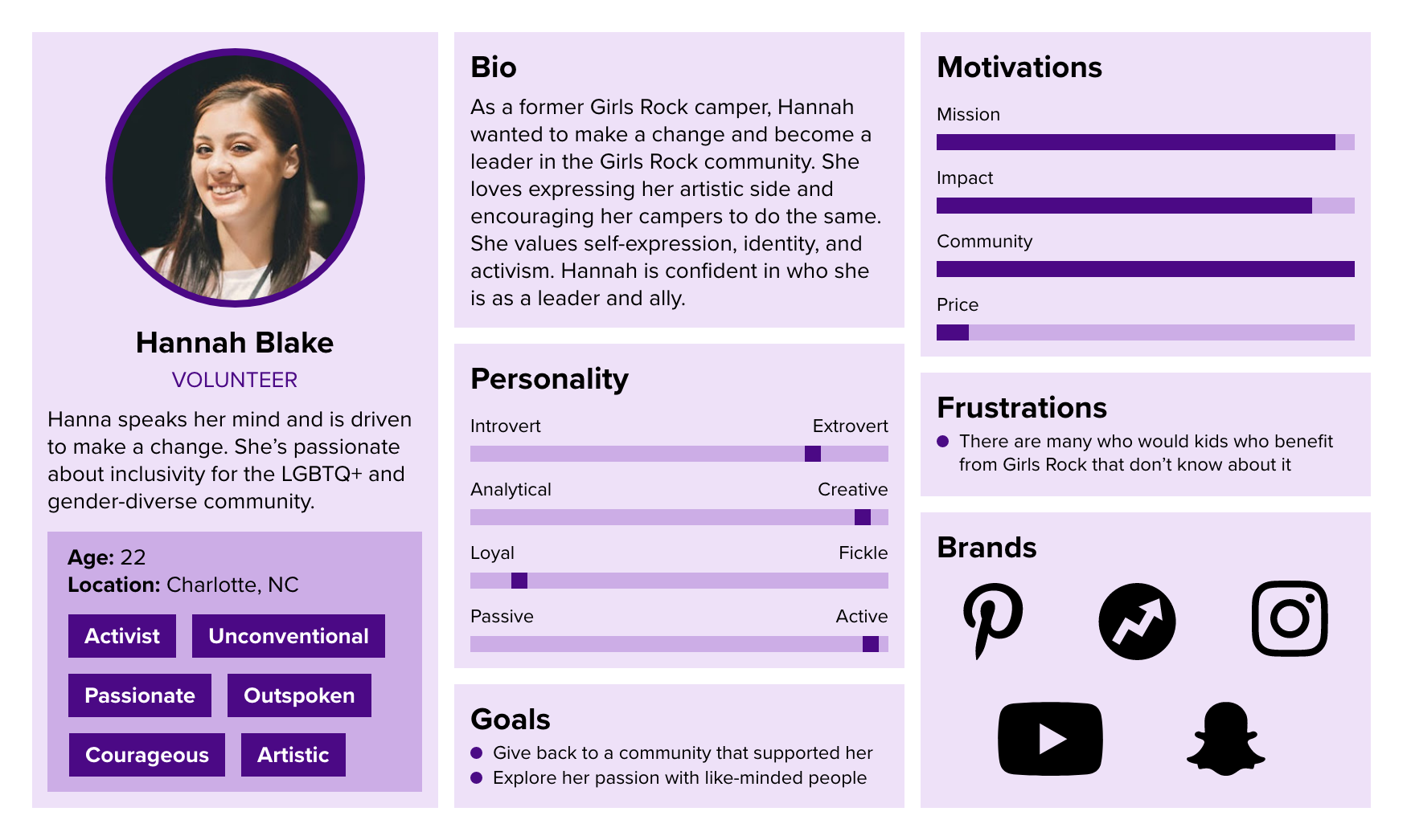
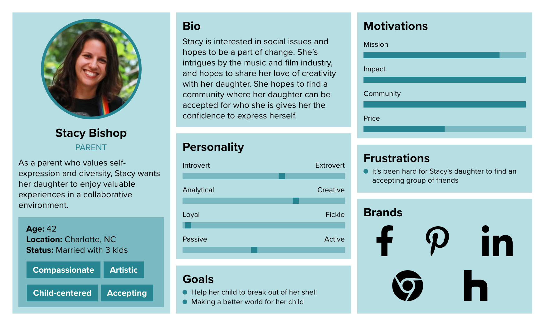
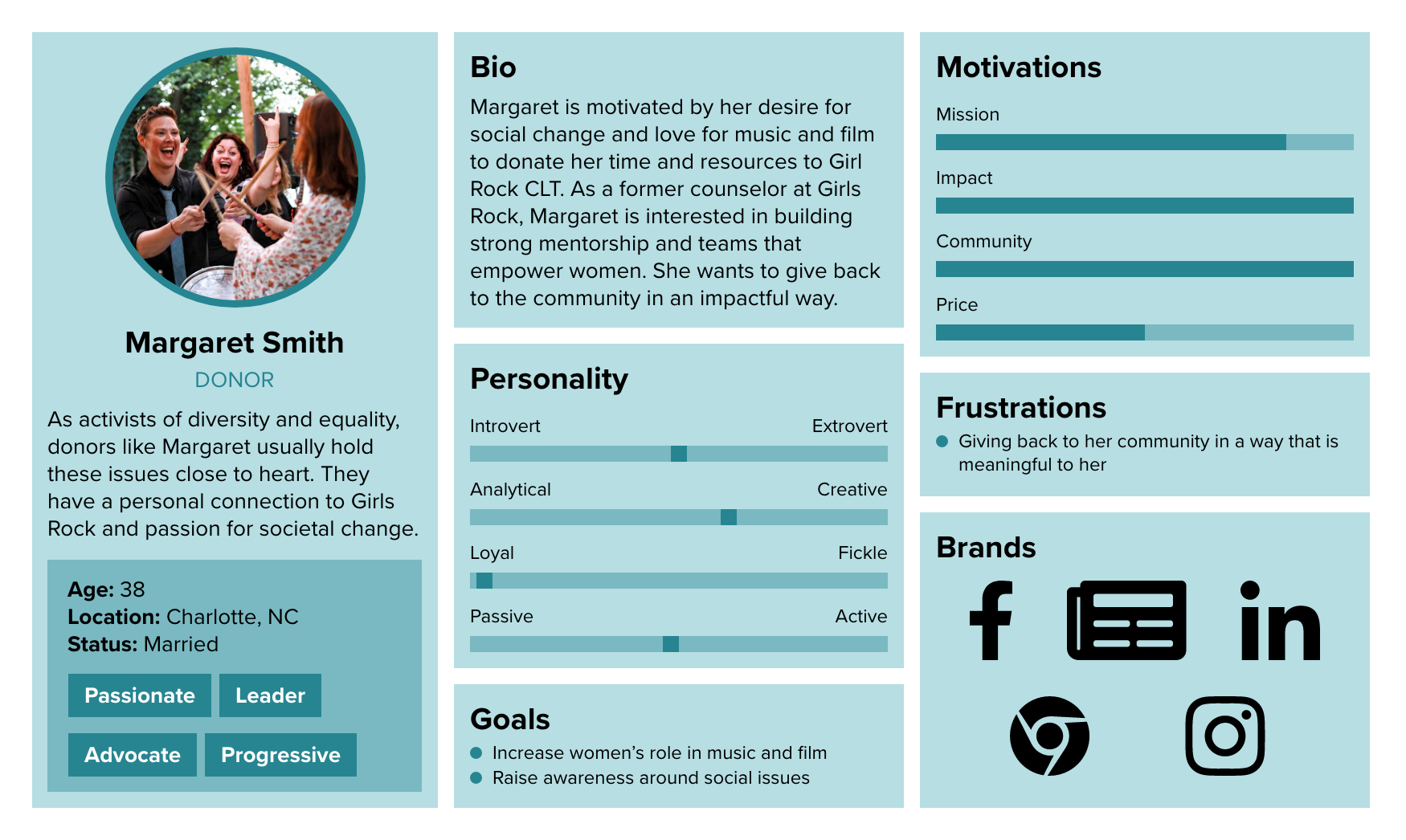
User Personas
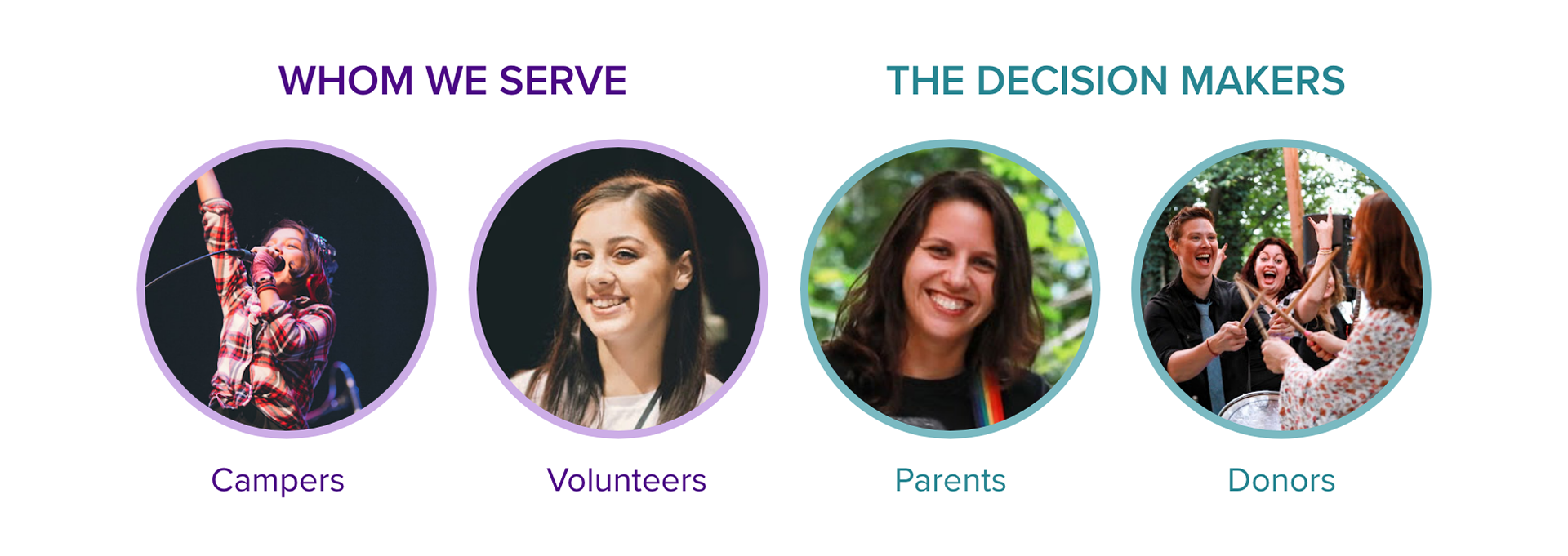
We divided the users into two groups: primary users, who are the decision-makers, including parents and donors who make monetary contributions to the organization through donations and camp enrollment; and secondary users, including campers and volunteers, whom the organization serves but do not interact with the website as much.
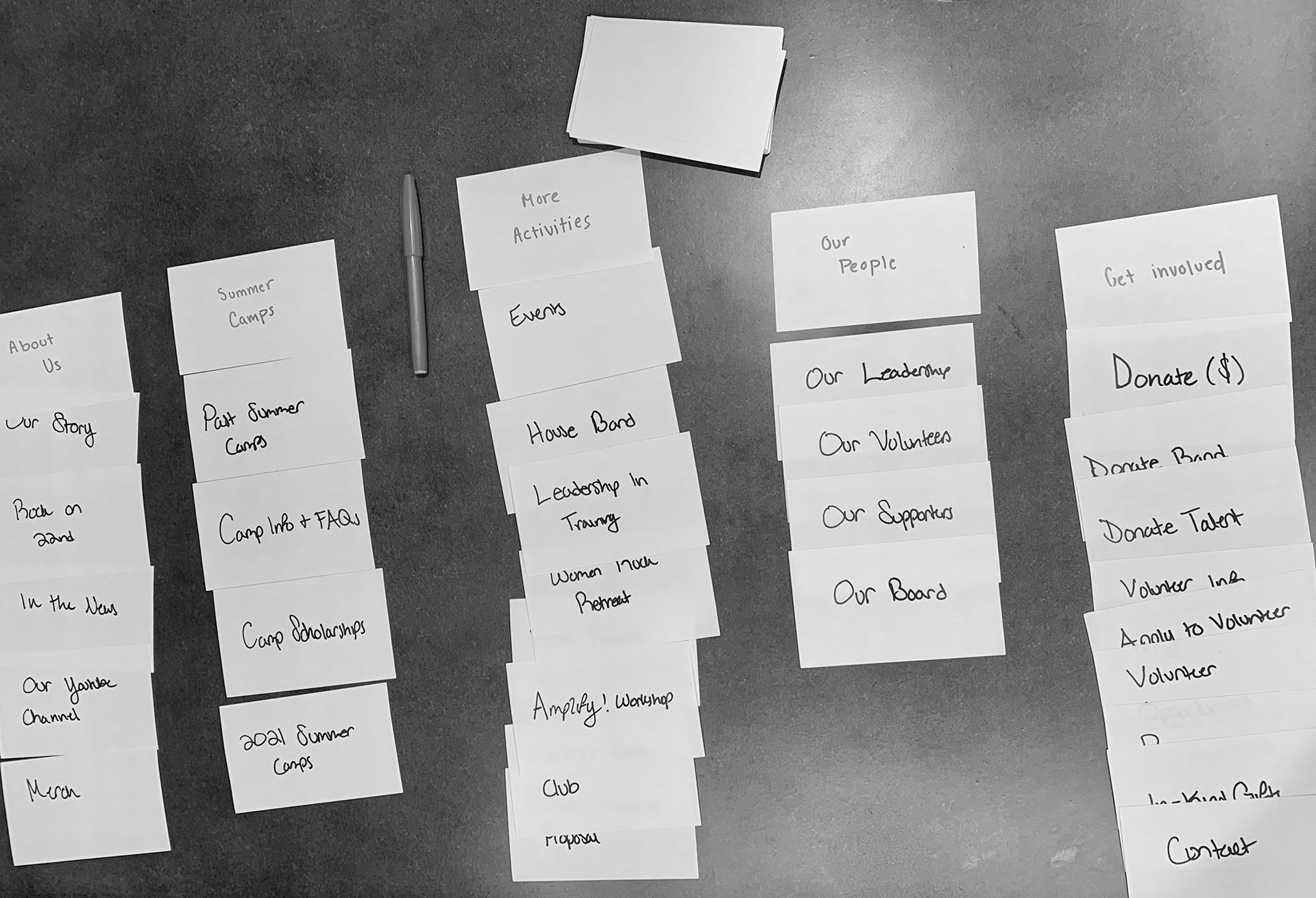
Card Sorting
To assist with the navigation and organization of the site, I selected eight people within the primary user group to participate in a card sorting research activity. They were asked to organize index cards with the name of every page in the Girls Rock website navigation listed on each card into categories that made the most sense to them. This study provided valuable insights into a site architecture that made the most sense to the user and allowed me to develop a better website menu and navigation paths. I also discovered that the names of certain pages were confusing to some users.
Competitor Analysis
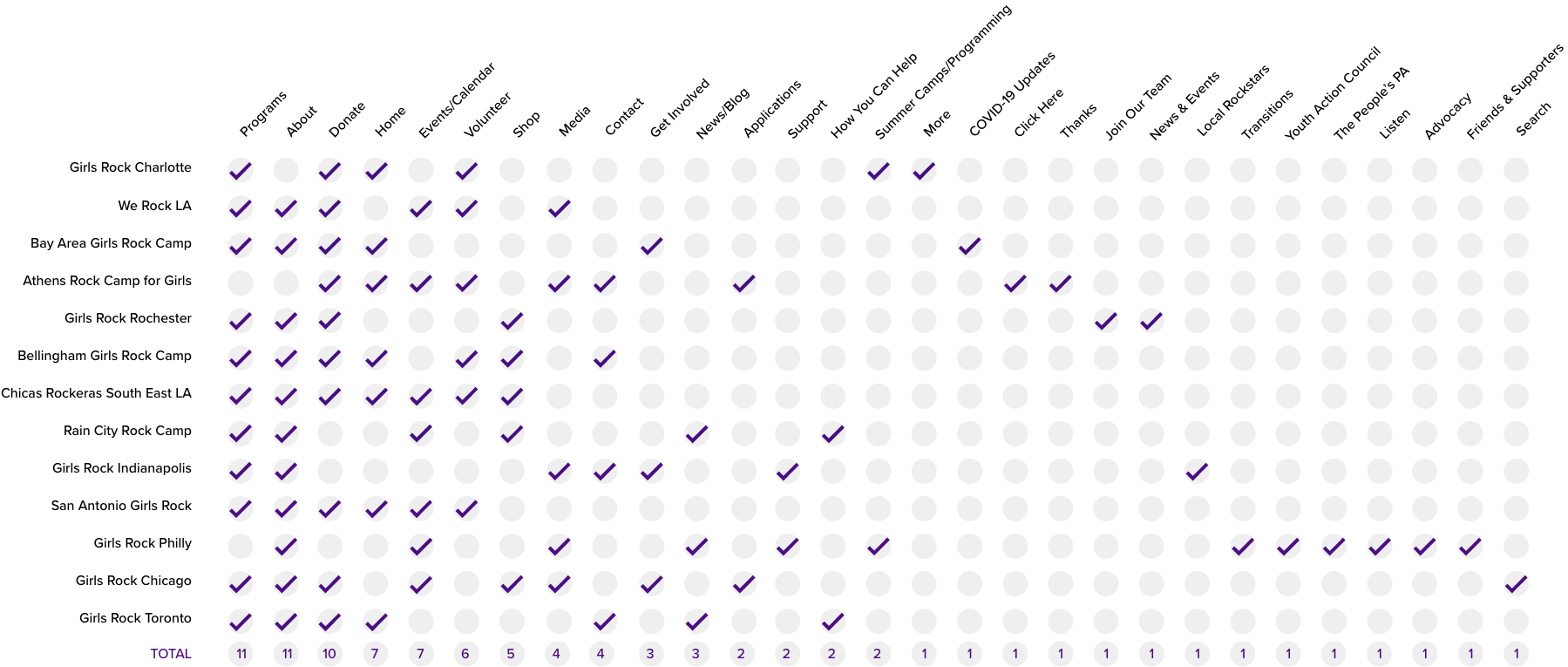
I conducted a competitor analysis comparing the Charlotte chapter with other Girls Rock chapters, analyzing their navigation and key features.
Solution
In addition to revamping the visual design and overall look and feel of the site, the navigation and information architecture needed to be streamlined and reorganized in a way that makes more sense to the user, creating a more intuitive and user-friendly experience.
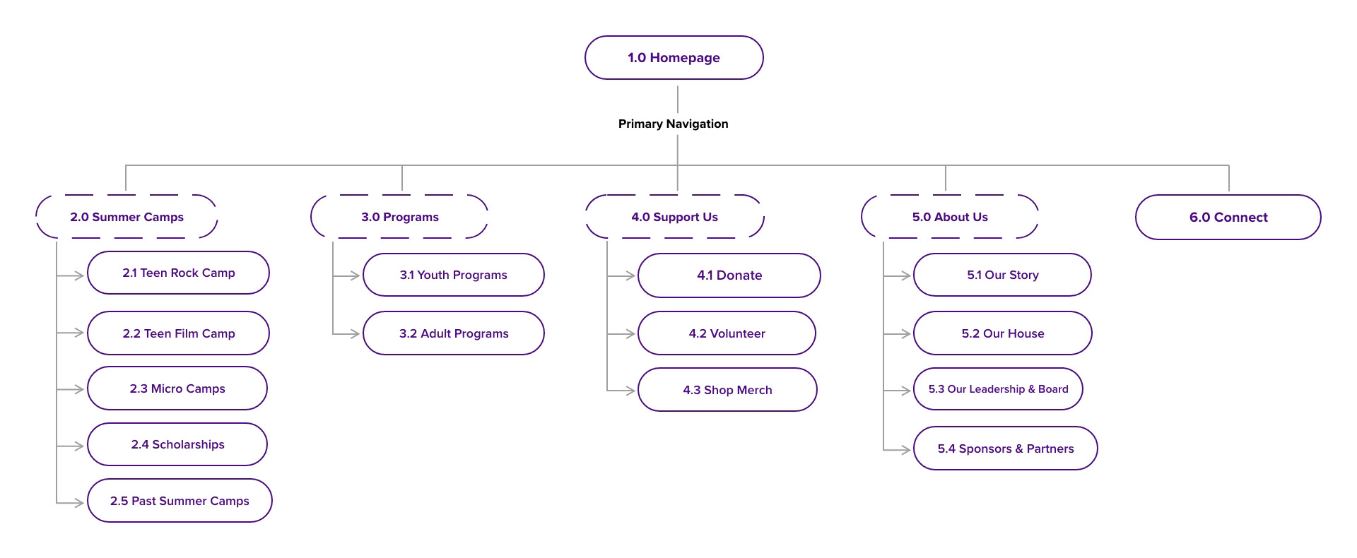
Site Map
Using the findings from my research, I reorganized the architecture of the site and developed a new site map that eliminated repetition and made completing tasks more intuitive for the user.
Sketches & Wireframes
I began sketching the pages of the site and turning those sketches into wireframes. In the sketches, I created a diagrammatic outline of each page, noting the important information and visuals for each page.
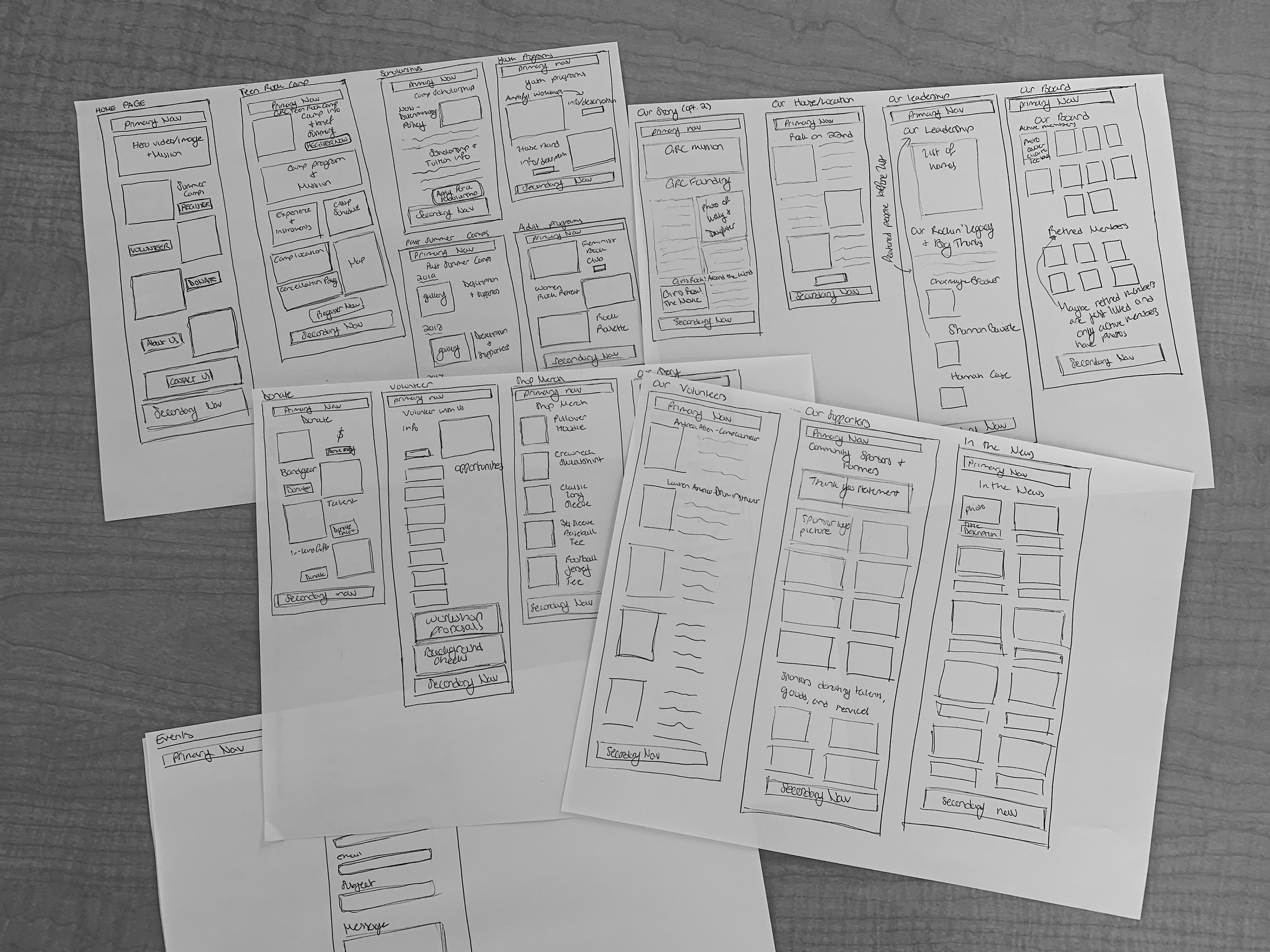
I then created wireframes, incorporating CTAs and copy, and began thinking about how the information could be visually broken up to keep users engaged.
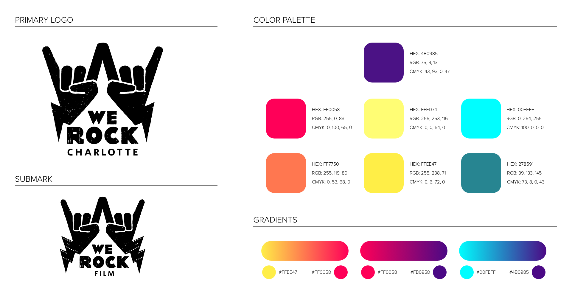
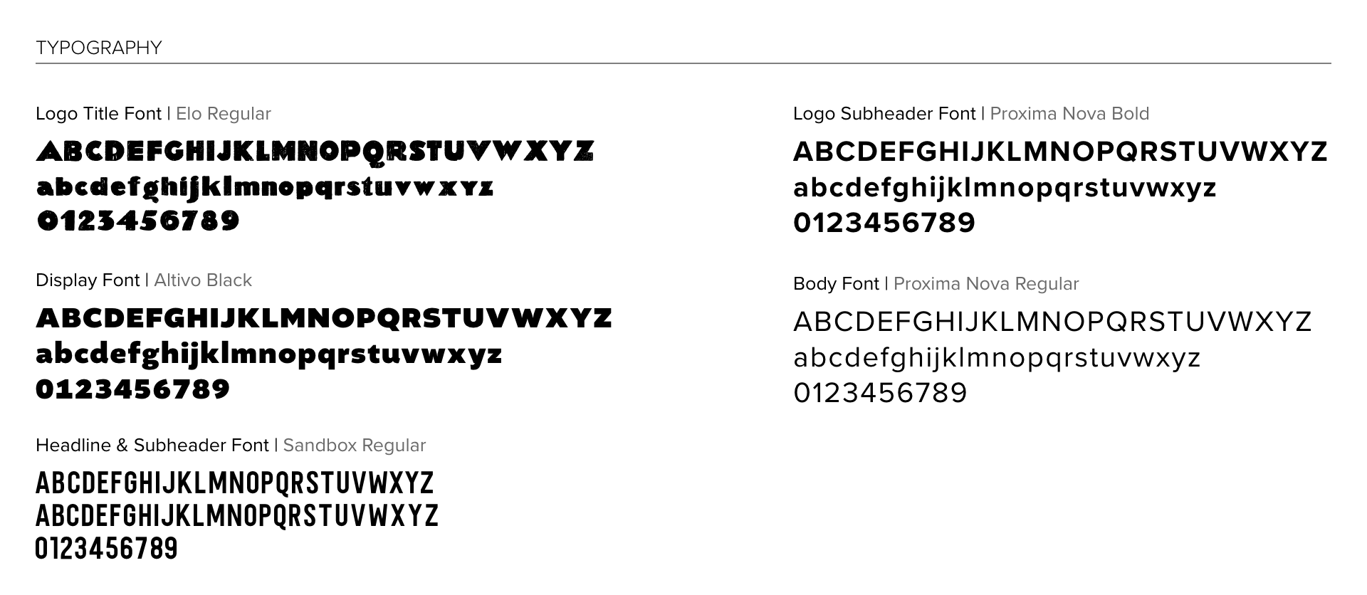
Style Guide
Once the graphic design intern finished the logo, I worked with her to define the typography and color palette.
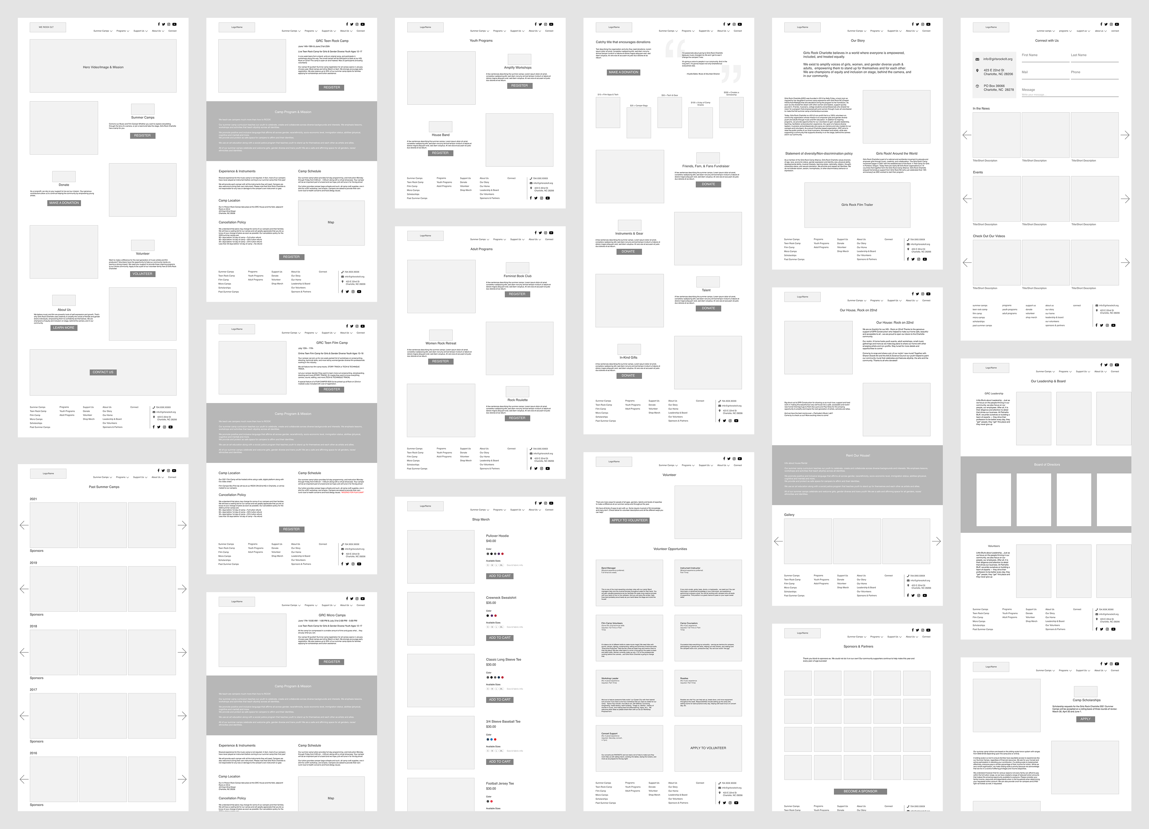
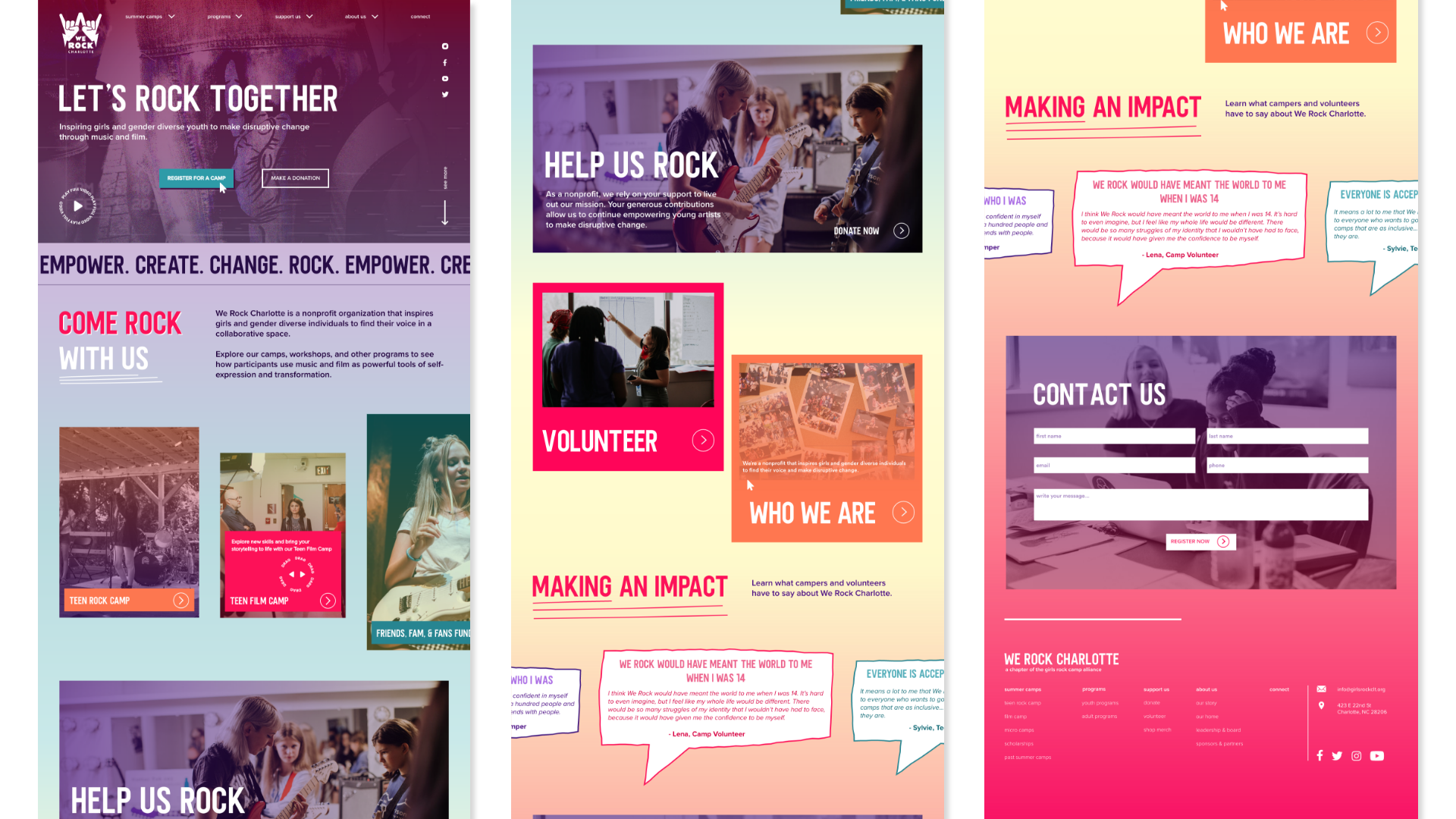
High-Fidelity Mockups
In addition to incorporating the color palette and typography into the wireframes, I also added photography and video, using different image treatments and gradient overlays to create visual interest.
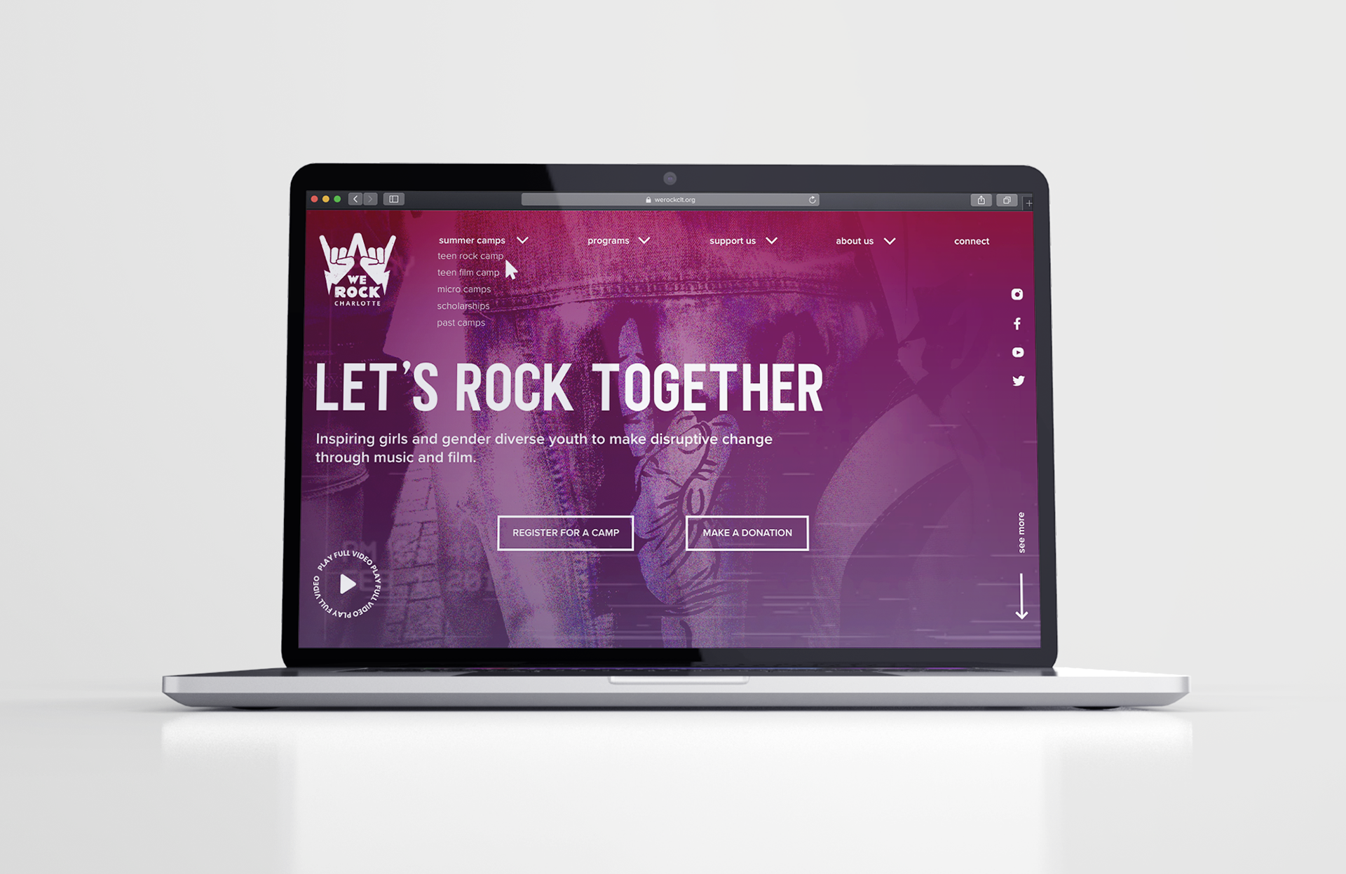
Homepage
I increased user engagement by incorporating primary and secondary CTAs above the fold.
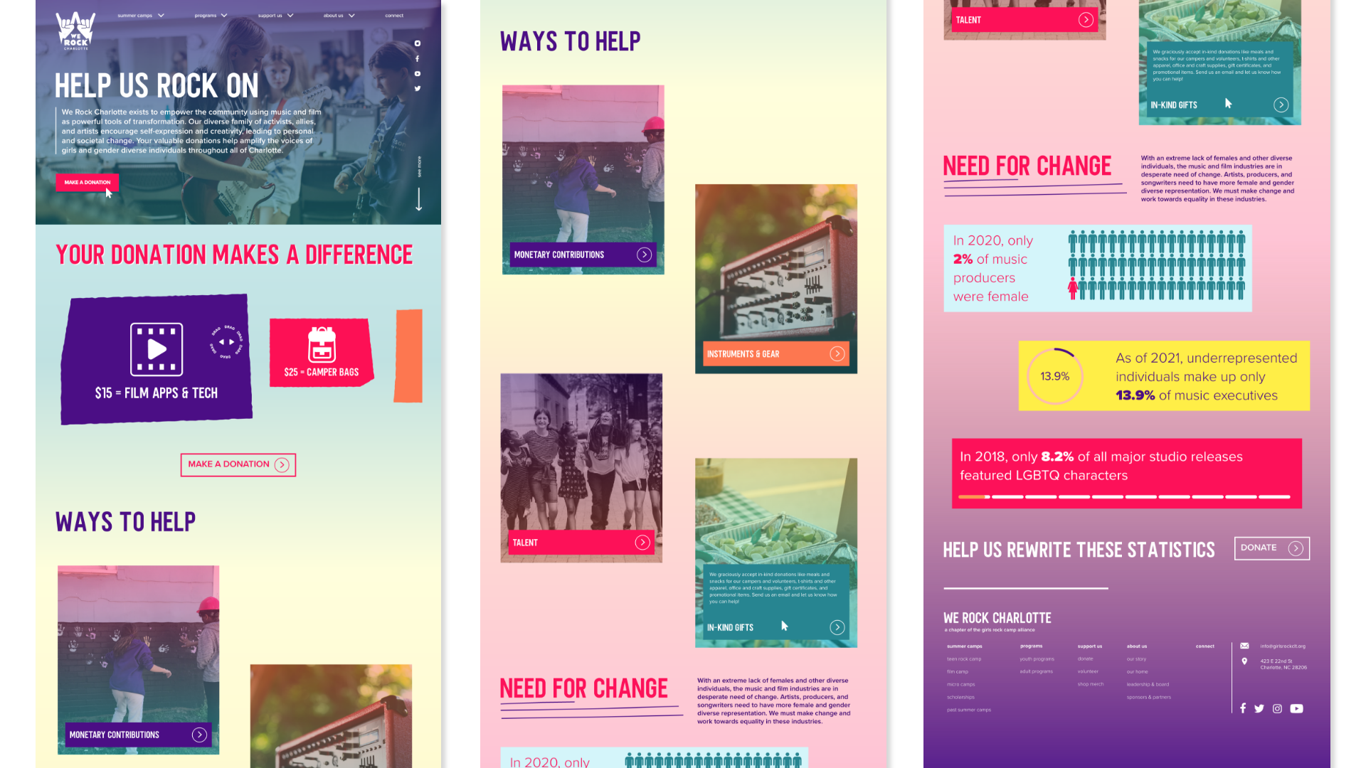
Donate
I emphasized the impact contributions to the organization make, as well as the organization's impact in the broader context of social change through graphics.
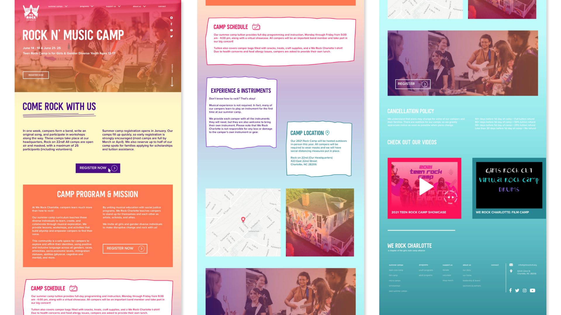
Rock Camp
I consolidated camp registration information into one page, making it easier for the user to find all the necessary information.
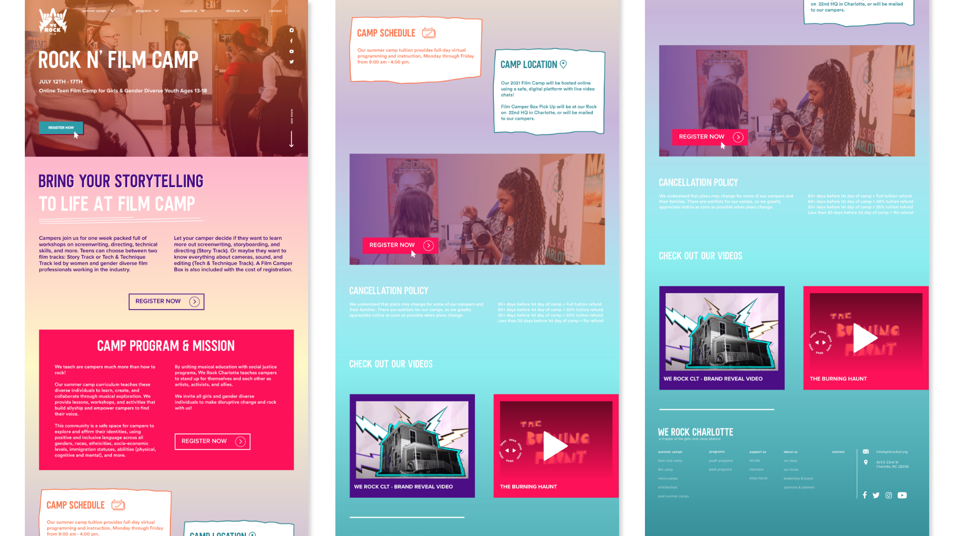
Film Camp
I ensured each camp page had all the necessary information, so users do not have to search through the site to find it.
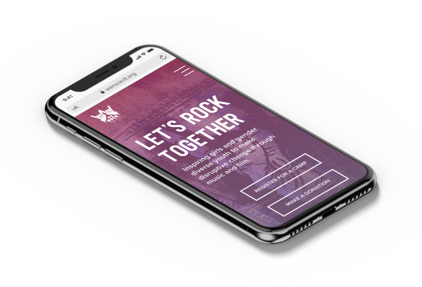
Mobile
Homepage Video Hero
To enhance user engagement, I incorporated motion graphics in the hero section, quickly communicating the organization's purpose to visitors. This resulted in increased engagement and a higher likelihood of users scrolling down and exploring other pages of the site.
Prototype
I implemented interaction states to convey the status of components to the user visually. This not only improved user experience but also provided users with clear and concise feedback on their actions.
Takeaways
Collaborating with interns from different disciplines, such as graphic design, video, photography, paid media, social media, copywriting, and insights, proved beneficial for this project. It strengthened the website's design and provided different perspectives, but it also posed some challenges. Since this project started with heavy research from the insights and copy interns and ended with creative work, the design was rushed. Therefore, I focused primarily on the overall structure and design of the site, as I did not have time to build all of the pages.
After the designs were handed over to the organization for development, I realized that I should have provided notes to the developer on certain issues, such as proper usage of the color pallet to ensure text/background color contrast requirements were met and adapting the design for different breakpoints to ensure its responsiveness. However, the client was pleased with the results, and the process went smoothly overall.